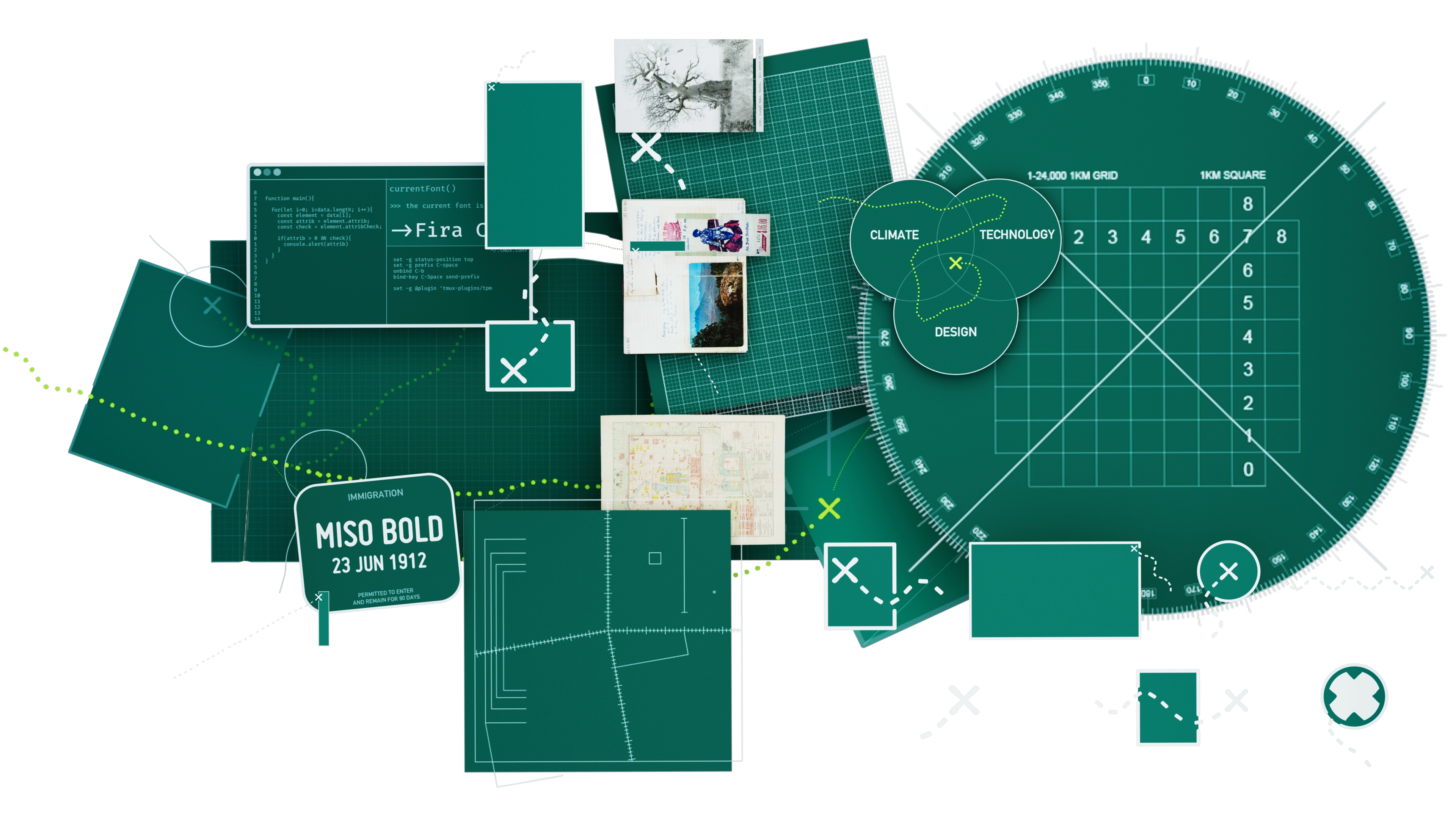
At its core, Crossground is an exploration of climate, technology, and design.
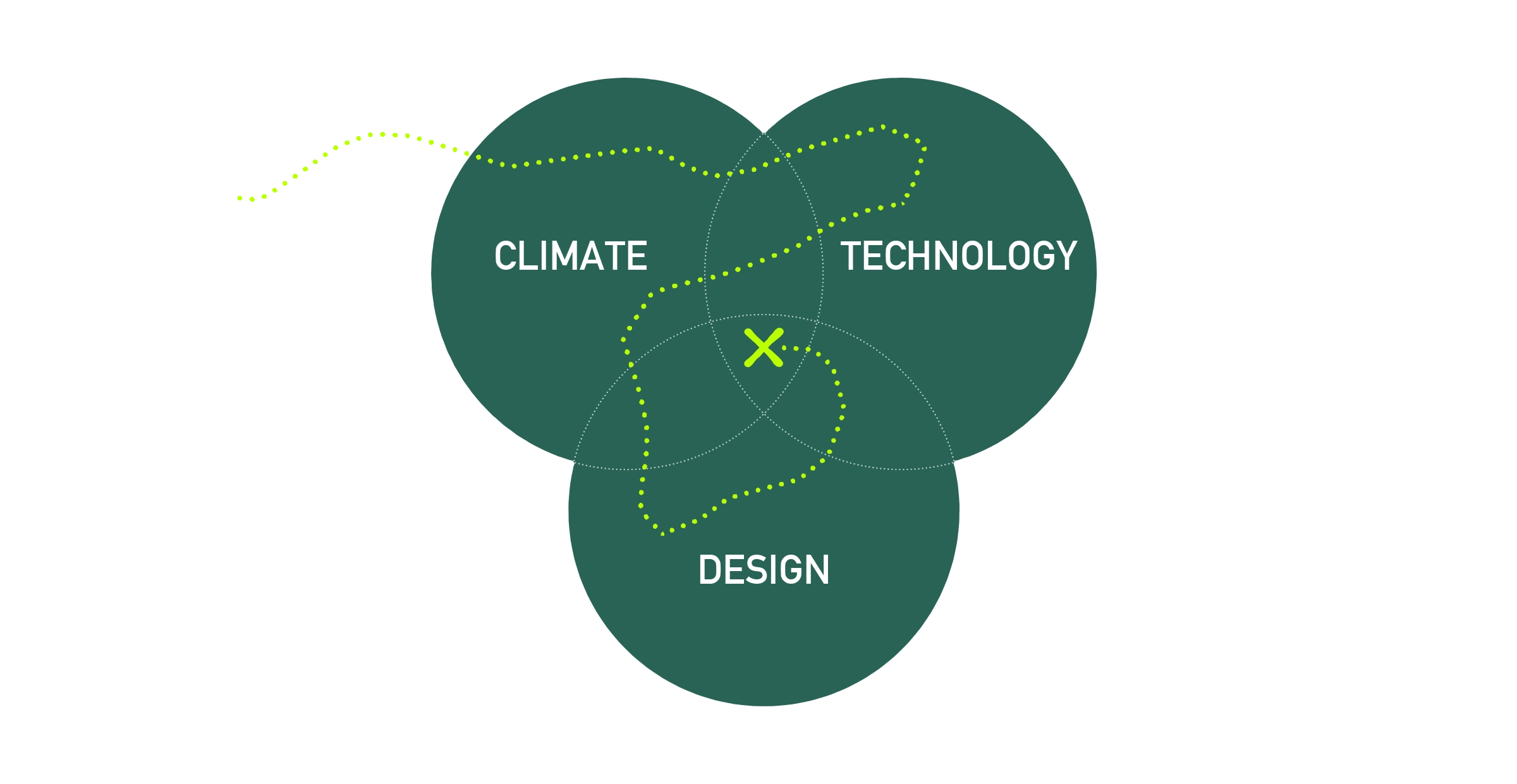
That makes the above diagram the most direct visual representation of what Crossground is, and so the goal of the branding is to capture this diagram: in everything from logo design and typography, to animation and interactivity.
Logo Design
A more detailed version of the above diagram would look something like this: a constant exploration through multiple fields, and with multiple destinations.
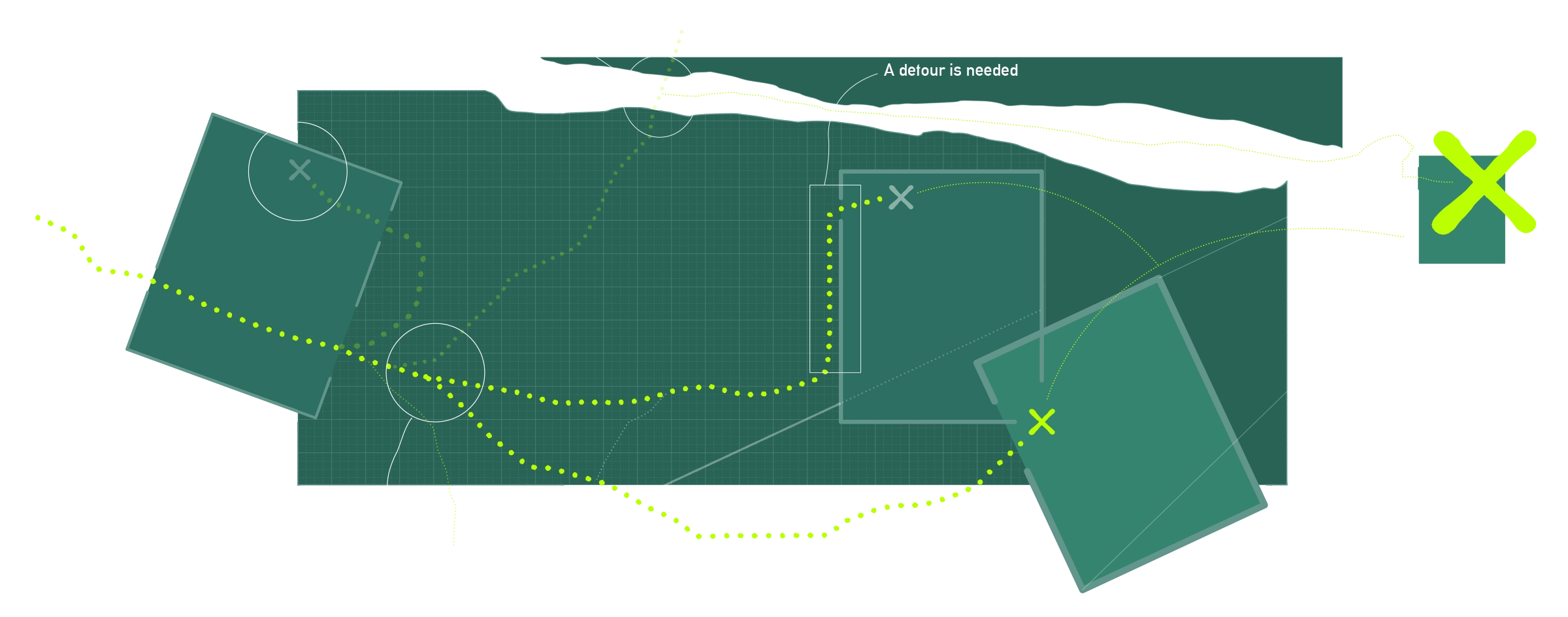
Each journey comes with unexpected twists and turns - but they all have three things in common: fields, exploration, and discovery. The Crossground logo distills these three elements.

Treating each piece of the logo as a configurable component creates a design system that works in many contexts. Components can grow to become windows, shrink to become icons, and animate to signal interactivity.
 Logo variations
 Type
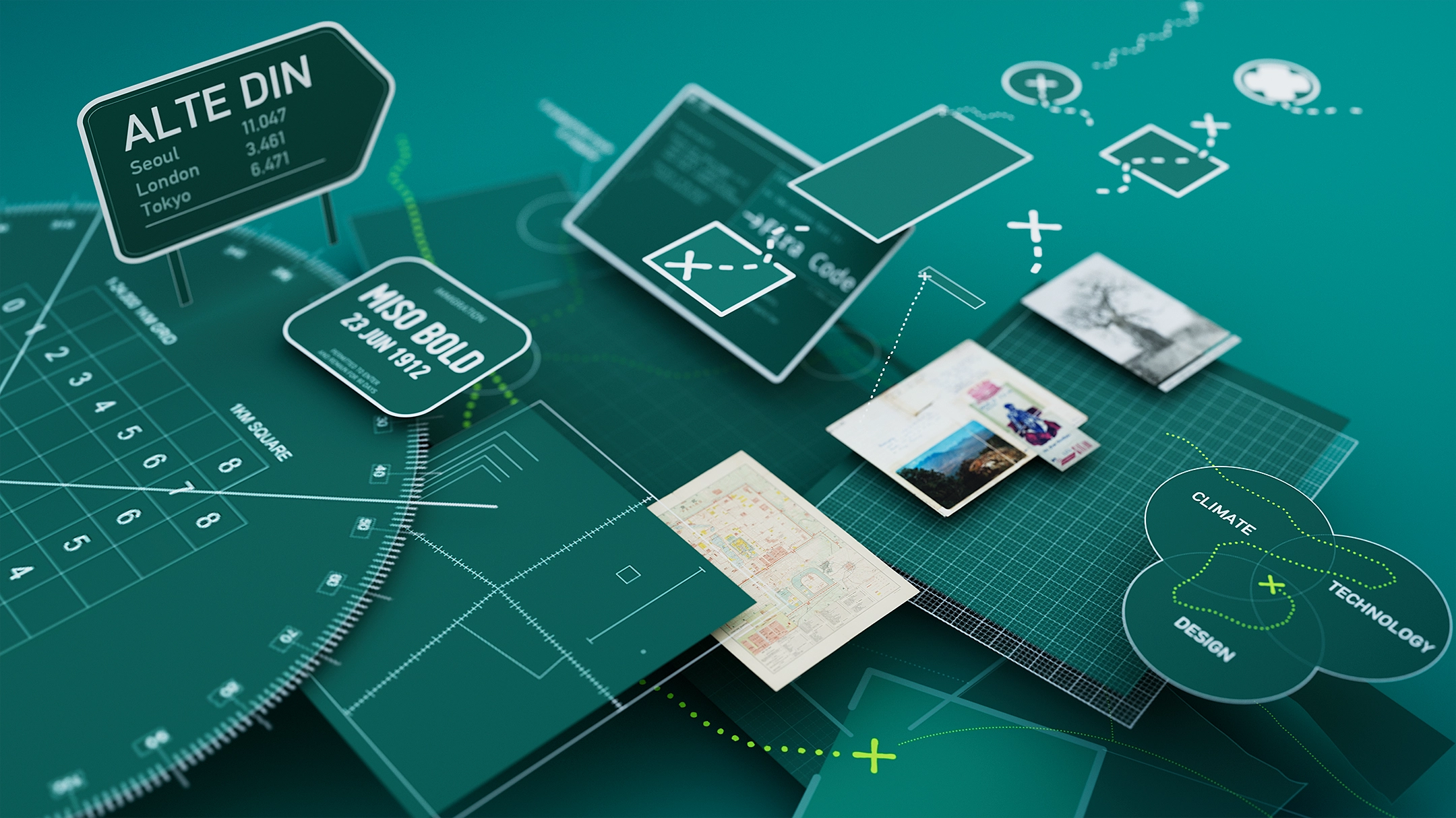
Three typefaces, referenced from the fields of design, exploration, and technology, come together to form brand typography.

Alte DIN
Inspired by the DIN 1451 standard from German public infrastructure, Alte DIN reflects a design-led approach: pragmatic, direct, and legible.
Variations of Alte DIN are used as the primary typeface for Crossground. It can be found everywhere from big, bold titles, to the copy in this paragraph.
Miso BoldMiso could have come straight from a passport stamp. It feels connected to exploration and record-keeping, and is used in Crossground branding for dates, and select subtitles.
-> Fira CodeA lot of Crossground projects are born in the terminal, and the
Nerd Fonts
Fira is used for captions, lists, and technical information.
Graphics
 Graphic elements reference navigational grids and guides
 Graphic elements are used sparingly - but when they are, they draw from the worlds of exploration and
There are no brand-related styles for data-visualization, because each visual is unique to its project. See ’
’ for more.Imagery
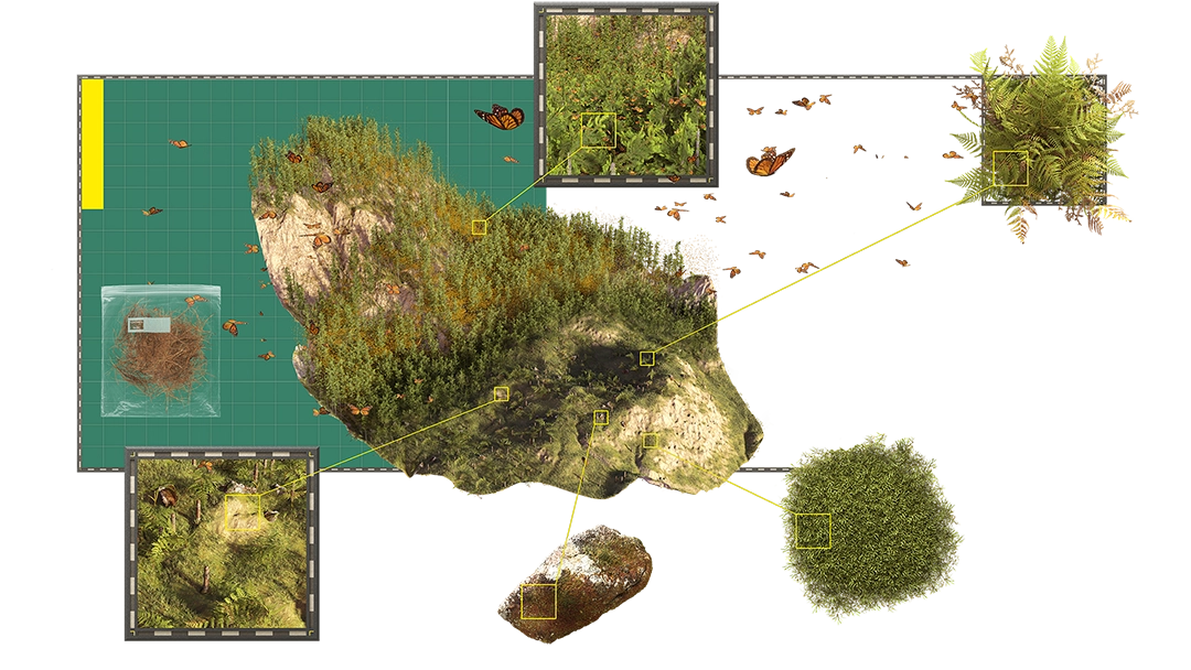
Imagery is treated as archival data: presented as it was found.
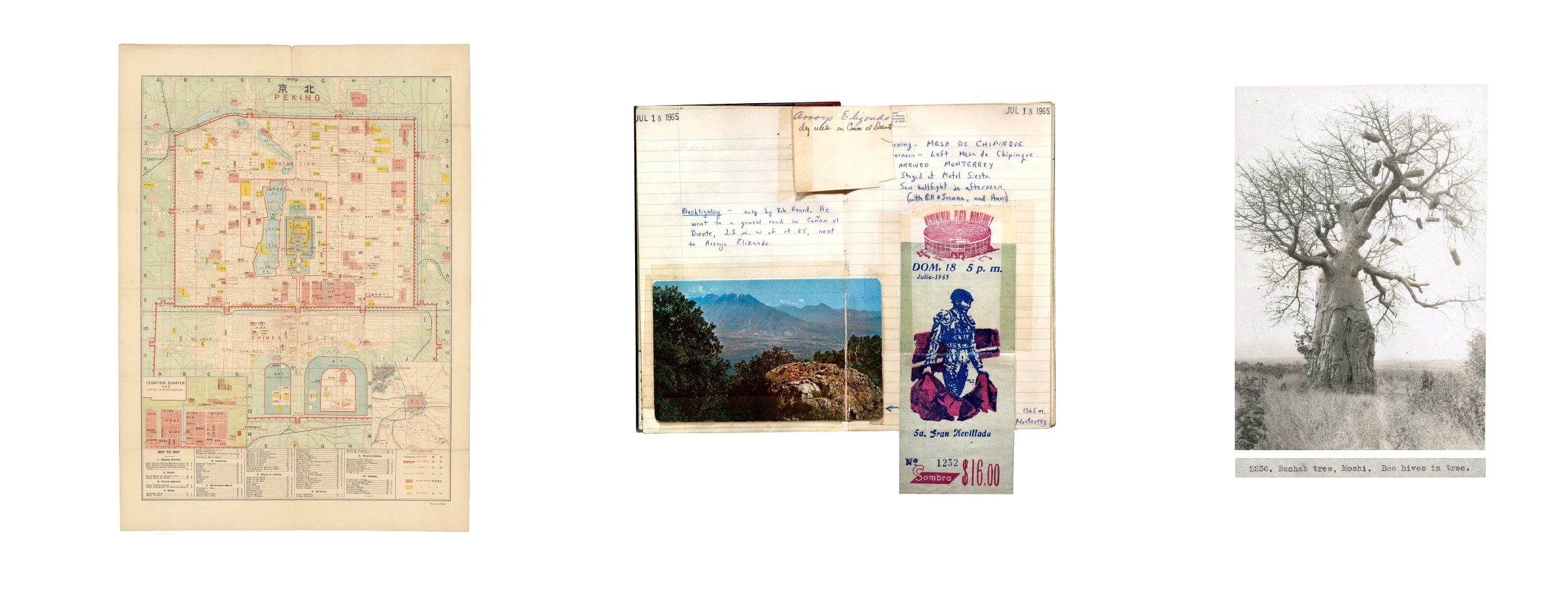
Archives of
, , and site photography show how a seemingly cold, analytical approach can be the most human: capturing the small details, doodles and notes that more polished methods discard.Animation
Animation serves two primary purposes: storytelling, and interactivity.
Animated Storytelling
Brand-related motion graphics are animated in a way that reflects their input references:
Animated data-visualizations, as with their static counterparts, are stylistically driven by context, and can employ any technique available to procedural VFX pipelines:
Animated Interactivity
The role of animation in interactivity is primarily to signal functionality: a user should know what a button will do before they click it.
This approach follows three key principles: Intuitive signaling, organic movement, and natural responsivity.
Color
Crossground engages in many projects, and each uses color to create a unique identity within the overall brand.
Using color in this way requires strict rules to maintain consistency and accessibility. To achieve this, a theme is parametrically defined as four colors: a background, a foreground, and two additional tones - one to complement, and one to contrast.
Color usage is consistent between projects: a specific type of sub-title will always use the ‘complementary contrast’ color from its project theme.
01 Mar 2026
item type
Title
Subtitle
Closing Thoughts
The Crossground brand should feel welcoming, human, and optimistic, while keeping itself rooted in technology, data, and innovation.
And so at its core, the brand identity aims to capture a humanized exploration of climate, design and technology. Wherever possible, these themes have been collided, creating a bold identity to distill a unique and complex approach into a clear, compelling story.