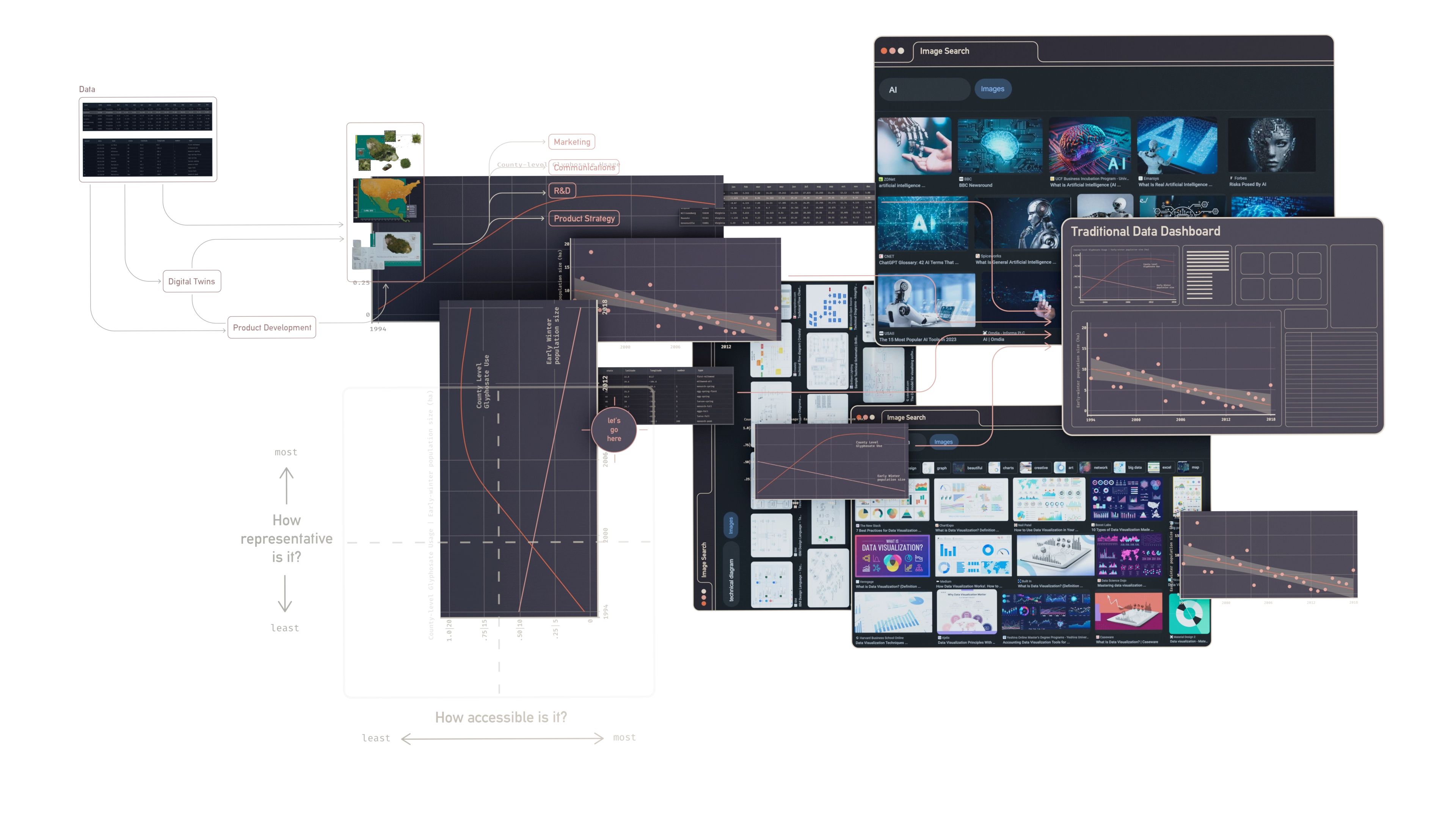
Our ever-growing hunger for information has created a world of ubiquitous data. We’re swimming in figures and statistics: from satellite images that track climate change, to census records that detail our changing populations.
Visualizing insights in such huge volumes of data is vital for making informed decisions, and as a result, data visualization peppers corporate boardrooms, pitch decks, and academic papers the world over.
This article makes the case for going further: broadening the audience and pushing the boundaries of data-driven communications by introducing ‘pineapple’ assets.
Broadening Audiences
Data visualizations are often designed for an audience with existing domain knowledge - like shareholders reading an annual report, or policymakers evaluating environmental performance.
It’s far less common to find data represented in marketing, sales, and public messaging pieces. This gap presents an opportunity for technically-driven organizations to differentiate themselves, and demonstrate expertize without compromising on accessibility or engagement.
Designing for this opportunity requires a new way of thinking about data and visualization: taking an approach that refuses to compromise on both accessibility, and representation.

Pushing the boundary
An image search for ‘data visualization’ reveals some of its conventions:
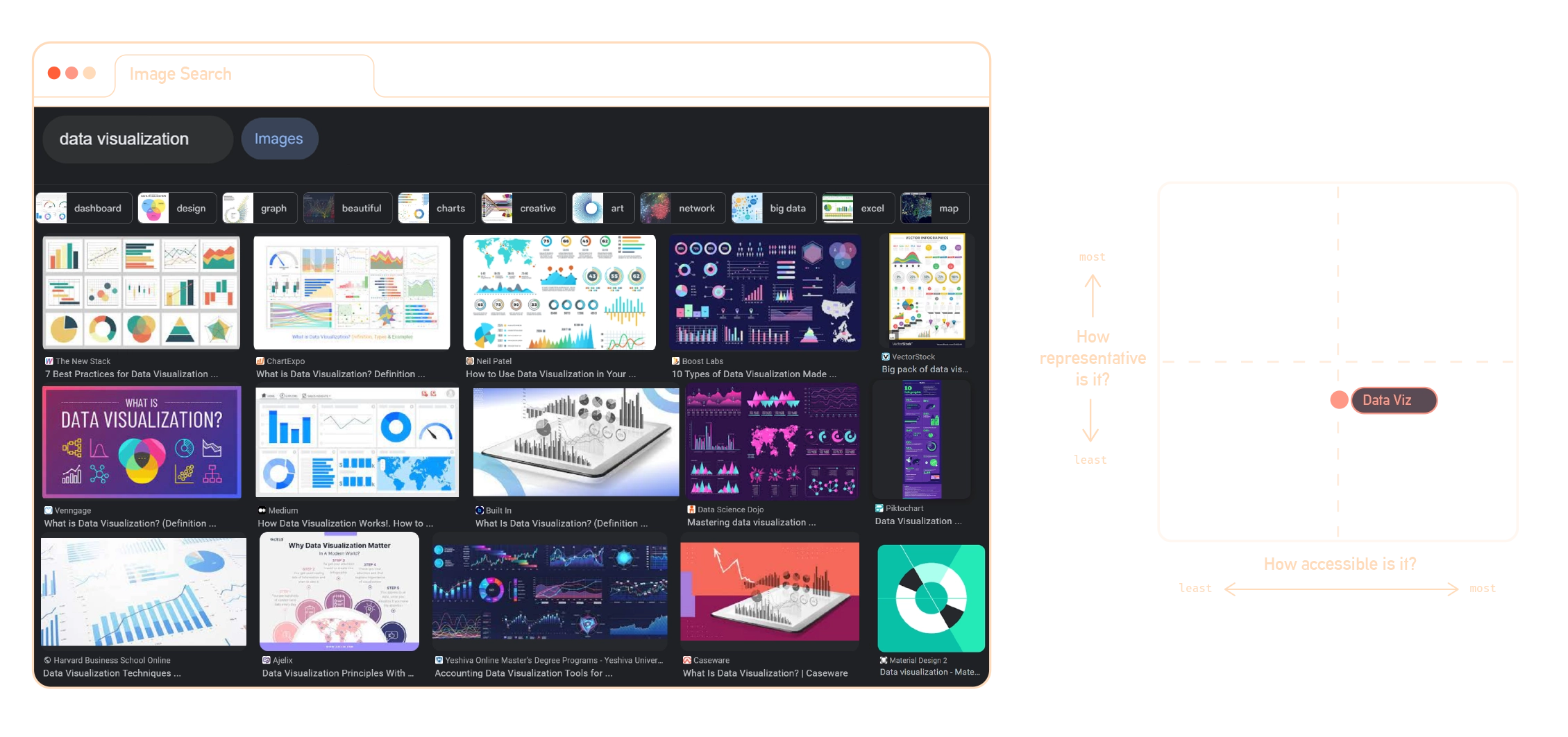
We find what we expect: colorful vector graphics drawn from a taxonomy of graphs, charts and diagrams. These elements are conventions for a reason: they’re effective. However, the reader is still required to learn how to read them. This is something that those of us working with data every day often forget - because it’s a language we already speak.
It’s no surprise then, that data visualization is noticeably absent from the communications materials used by organizations to reach a broader audience. In their place, we find glossy, conceptual visuals and stock images. The more complex the topic, the more vague the imagery, until conventions appear once again.
Take the image search results for ‘AI’ as an example.

Unsurprisingly, results are dominated by blue, glowing digital brains and humanoid robots. Imagery like this is chewing gum for the eyes: so commonplace that a viewer barely notices it.
On the other side of the coin, technical communications aimed at a specialist audience are highly informative and unique. Reaching a wider audience with these visuals is difficult, both because they can be impenetrable, and because they often look like this:
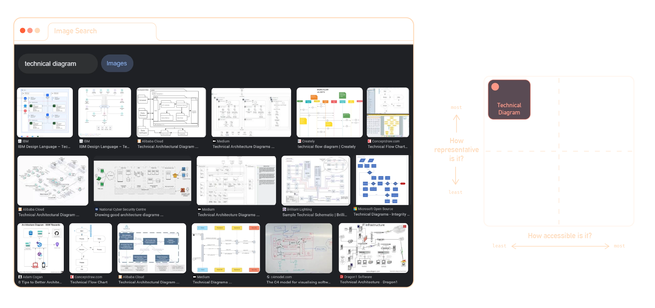
We’re interested in the upper-right quadrant of the above diagram: the undefined space where technical and strategic communications meet. Let’s call assets in this quadrant ‘pineapple assets’.

In industries as powerful and intricate as AI, explaining complexity to a wide audience with transparent and engaging communications is vital - so why don’t we see more pineapple assets in the world?
The answer is that working in the pineapple segment is hard. It requires a combination of domain expertize, design thinking, and technical innovation.
As a result, few organizations are able to capture this value, which makes it even more powerful for three key reasons:
differentiation
In a world of conventional content, investing in pineapples can set an organization apart with unique, powerful, personal assets.
proof of expertize
Organizations that demonstrate the simple communication of complex ideas are able to signal their expertize, and cement their position as a thought leader in their field.
Importantly, pineapple assets enable an organization to tell stories with its data that demonstrate transparency, while protecting the commercial value and privacy of its underlying datasets.
intuitive mental models
Building consistent mental models is key to communicating complexity. Whether that’s two biologists discussing gene therapy, or a professor teaching linear algebra, a mental model should be intuitive and spatial: because that’s how our brains work best.
You can think of pineapple assets as building this visual mental model, and bringing it to life with real-world data.
Pineapple Production
Monarch butterfly populations have crashed by over 80% since 1990. Creating a pineapple asset to explore the huge amount of relevant data can reveal the patterns behind their collapse, and create an intuitive mental model for communicating those insights to others.
We’ll begin with some
captures citizen sightings of the butterflies’ annual journey. Included in the data are sightings of butterflies, eggs, and milkweed: the vital plant that the butterflies use as a habitat.| record | data | town | state | latitude | longitude | number | type |
|---|---|---|---|---|---|---|---|
| 1 | 07/21/20 | La Mesa | CA | 32.8 | 0117 | first-milkweed | |
| 2 | 07/29/20 | Aurora | CO | 39.6 | -104.8 | milkweed-all | |
| 3 | 07/31/20 | Allenton | WI | 43.4 | -88.4 | 1 | monarch-spring |
| 4 | 07/31/20 | Mocksville | NC | 35.9 | -80.5 | 1 | egg-spring-first |
| 5 | 07/31/20 | Coram | NY | 40.9 | -73 | 5 | egg-spring |
| 6 | 07/31/20 | Arnold | MD | 39 | -76.5 | 5 | larvae-spring |
| 7 | 12/31/20 | Eastpoint | FL | 29.7 | -84.9 | 1 | monarch-fall |
| 8 | 12/31/20 | Brenham | TX | 30.2 | -96.4 | 3 | eggs-fall |
| 9 | 12/31/20 | Orlando | FL | 28.5 | -81.5 | 2 | larva-fall |
| 10 | 11/10/20 | Monterrey | NLE | 25.7 | -100.3 | 200 | monarch-peak |
We start with a deep analysis of the underlying data. This reveals patterns, narratives, and opportunities for creating assets that can explain them.
| name | FIPS | state | jan | feb | mar | apr | may | jun | jul | aug | sep | oct | nov | dec |
|---|---|---|---|---|---|---|---|---|---|---|---|---|---|---|
| Fairfax | 51059 | Virginia | -1.385 | 3.545 | 7.18 | 14.22 | 19.245 | 23.555 | 27.835 | 25.255 | 21.34 | 13.13 | 9.485 | 5.88 |
| Radford | 51750 | Virginia | -1.415 | 4.19 | 6.94 | 14.145 | 17.53 | 25.19 | 25.19 | 23.89 | 19.55 | 12.17 | 9.29 | 5.59 |
| Washington | 51191 | Virginia | -0.87 | 4.325 | 7.69 | 14.13 | 17.305 | 21.75 | 24.05 | 22.765 | 19.175 | 11.74 | 9.135 | 5.745 |
| Araphoe | 08005 | Colorado | -0.16 | -0.345 | 7.39 | 9.7 | 12.665 | 21.785 | 26.5 | 26.045 | 18.675 | 12.3 | 5.38 | -0.98 |
| Williamsburg | 51830 | Virginia | 1.235 | 5.815 | 8.54 | 16.115 | 8.54 | 25.185 | 28.165 | 26.56 | 22.83 | 15.605 | 11.525 | 8.11 |
| Roanoke | 51161 | Virginia | -1.135 | 4.56 | 7.23 | 14.54 | 18.145 | 23.39 | 26.55 | 25.2 | 20.53 | 12.91 | 9.715 | 5.875 |
| Greensville | 51081 | Virginia | 1.33 | 6.425 | 9.33 | 16.67 | 20.395 | 26.33 | 29.43 | 27.305 | 23.11 | 15.295 | 11.2 | 8.115 |
Traditionally, we would create a series of charts and graphs to explain what we found.
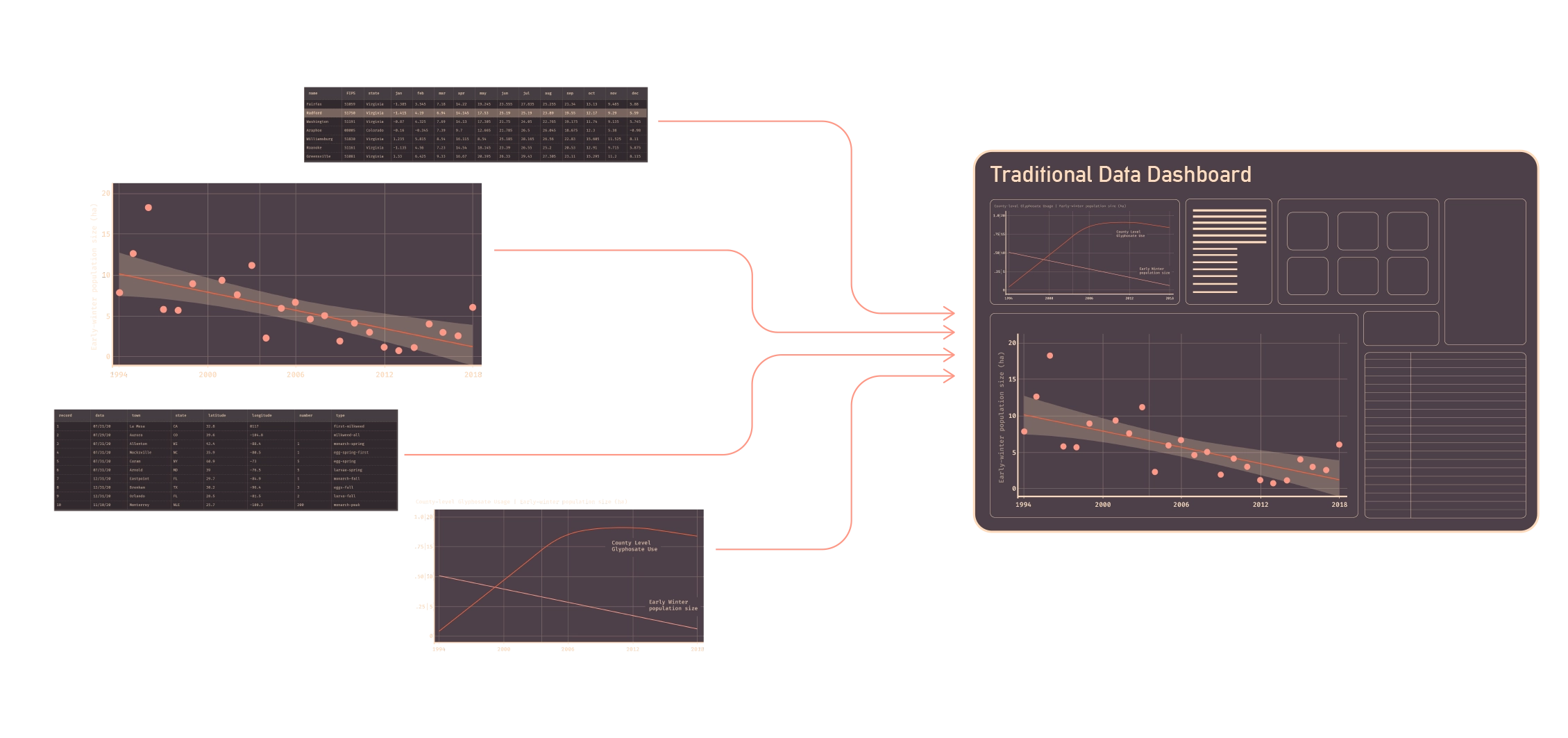
These can be effective for individual patterns, but it’s hard to get a sense of the true nature of the data, and questions still remain..
- How many butterflies were sighted?
- In which counties were they sighted most, and at what time of year?
- What does the relationship between their habitat and population look like?
Traditional approaches require individual assets to answer each of these questions, and combining patterns into single assets can compromise legibility.
Visualizing the behaviors as a map helps to answer these questions, but when it’s static, we still fall short of an intuitive understanding:
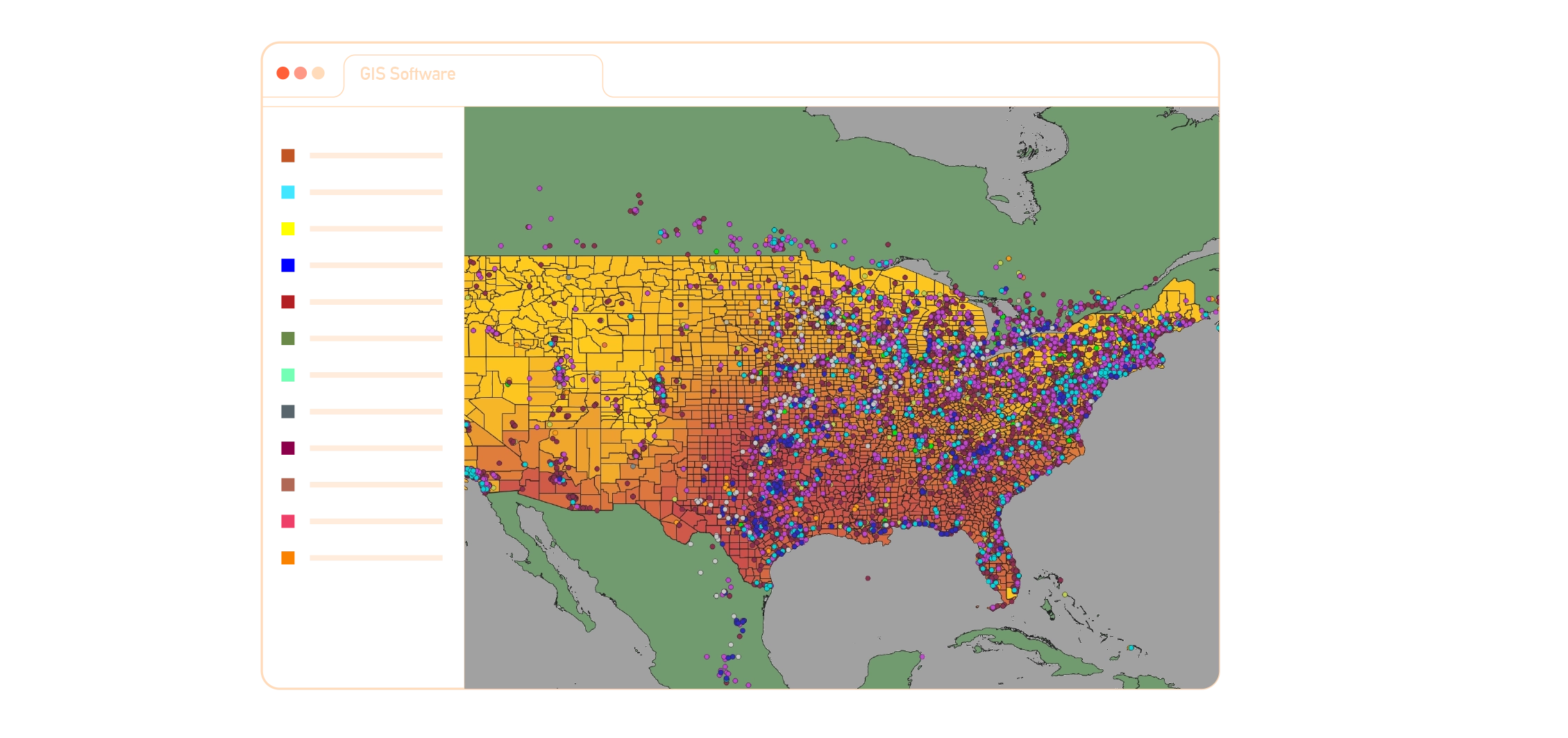
It’s only when layering these things on top of each other, and animating them, that the patterns reveal themselves in a way that feels natural:
This is a simple example, but the approach can reveal huge amounts of value for more complex datasets too: from creating data-driven case studies, to imaging the inner workings of a
In the case of the monarch butterflies, data-driven mental models like this can become an invaluable resource for organizations of all types:
- A conservation group could position assets like these at the center of their communications efforts, sparking conversations between policymakers, farmers, and the general public.
- A smart-farming company could build on the analytical methods used in pineapple creation to reveal entire pools of untapped value, with assets developed to inform how and where it can reduce pesticide usage.
- A media company could leverage the computational nature of pineapple production to create assets that are automatically updated and released each year, as new data is published.
The computational pipelines behind pineapples are powerful, enabling rapid prototyping, rich variation, and endless extensibility. Pineapples can be updated automatically, edited with ease, and, visually refined, and extended to other operational units in an organization, from R&D, to marketing and sales.
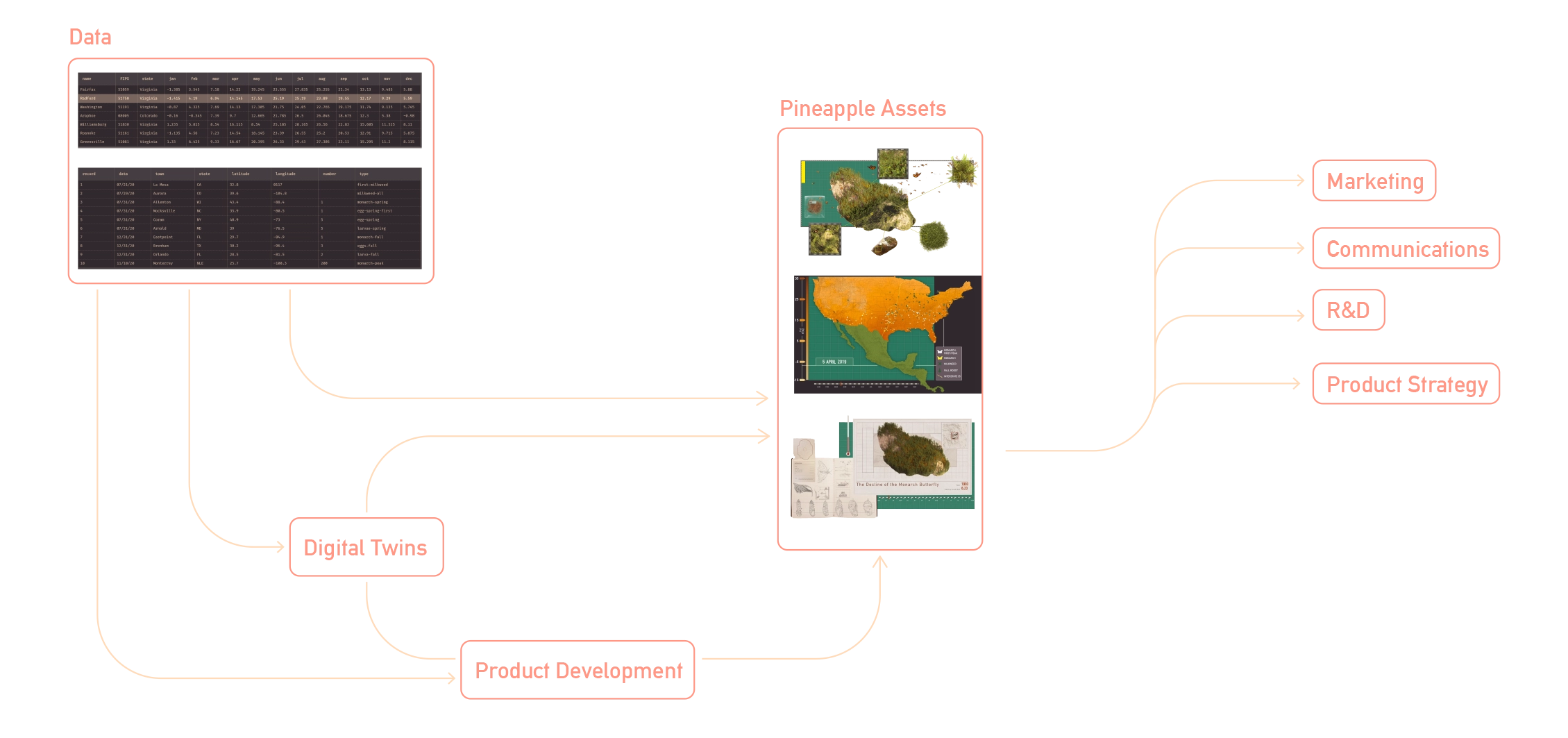
Connecting operational units with pineapples has a compounding effect: unlocking better communication, more innovation, and strengthening shared mental models across an organization.
go a step further - proposing a single digital twin that spans an entire organization. No matter the level of integration, pineapples enable the creation of powerful data-driven visualizations that demonstrate expertize with transparency, and drive engagement with intuitive design.Organizations interested in engaging with Crossground on pineapple assets are encouraged to reach out at